Worried your monochrome prints look flat or muddy? Black and white fine art photography comes down to deciding, before you shoot, which tone each part of the scene should become. The Zone System gives you the method.
This page is part of the wider guide to fine art photography.
| Item | Value |
|---|---|
| Number of zones in the Zone System | 11 zones (0 through X) |
| Middle gray (Zone V) | 18% reflectance |
| Distance between neighbouring zones | one stop of exposure |
| When Adams and Archer worked the system out | around 1940 |
| Zones usually taught as the “full detail” range | Zone III to Zone VII |
These figures come from the PhotoWorkout Zone System guide and the Photography Icon glossary entry. Sources describe the system slightly differently and can change, so check them before you rely on the figures.
Why tone matters more than color in monochrome
Without color, tone does all the work. Brightness has to separate a red shirt from a green wall, and the balance of light and dark areas sets the feeling of the whole picture.
That is why black and white fine art photography rewards decisions made before the shutter clicks. The best-known method is the Zone System, which Ansel Adams and Fred Archer worked out around 1940 for black and white film, according to the Photography Icon glossary.
The reason it exists is a quirk of metering. A reflected light meter turns whatever it reads into middle gray, so a white wall comes out gray and a black cat does too.
The answer is previsualization: deciding, before you press the shutter, how each part of the scene should look in the finished picture. The zones are the vocabulary for that decision.
Reading the tonal scale: the eleven zones
The system divides the tonal range into 11 zones, numbered 0 (pure black) to X (pure white), as the PhotoWorkout guide, published April 19, 2026, describes it. Each step up is one stop, so it doubles the light, and each step down halves it.
A few zones are worth memorising:
- Zone 0: pure black, the deepest the paper can give.
- Zone III: a dark tone with full texture.
- Zone V: middle gray, the 18% tone a meter assumes.
- Zone VII: light gray with texture.
- Zone X: the pure white of the paper.
Zones III and VII are often taught as the endpoints of full detail: below Zone III shadow detail is lost, and above Zone VII highlight texture starts crushing. The Photography Icon glossary draws the line a little wider, with Zones II to VIII forming the textural range, so treat the exact edges as a guide.
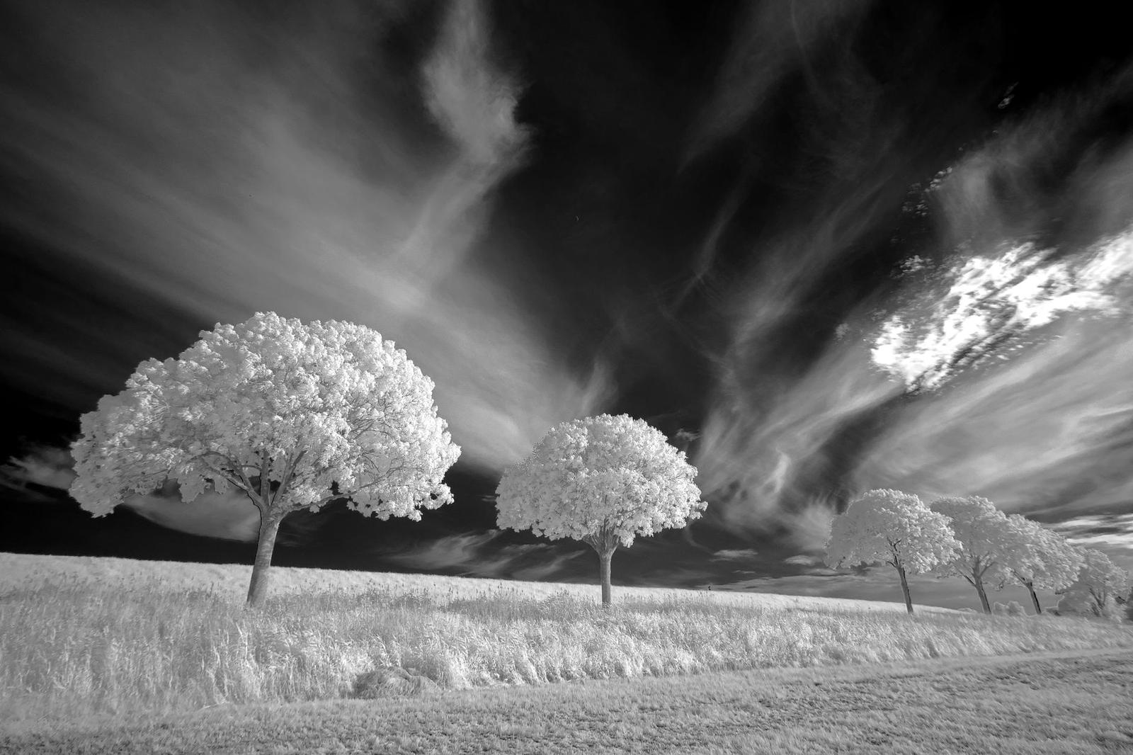
How do you place a tone with a meter?
You place one tone on a chosen zone by setting the exposure, and every other tone then falls wherever the scene’s brightness puts it. Here is the worked example from the Photography Icon glossary, using a spot meter:
- Read the darkest shadow that must show texture. The meter suggests f/8 at 1/60 second, which would render it as Zone V, far too light.
- Give two stops less, f/8 at 1/250 second, to place the shadow on Zone III.
- Read the brightest area that must keep texture, such as a sunlit cloud. At four stops above the shadow reading, it falls on Zone VII.
- If that cloud sat six stops above the shadow, it would fall on Zone IX and lose its texture.
The same arithmetic fixes snow. Left to the meter it turns a dull gray, while two stops more puts it on Zone VII, bright with its texture intact.
When a scene holds more stops than the textured zones can fit, you have to choose. Moving the exposure to save the cloud pushes the shadow down a zone, and the other way round. Deciding which end matters for this picture is the creative decision the system makes visible.
Controlling contrast: expose for the shadows, develop for the highlights
Norman Koren’s tutorial, republished by Luminous Landscape, credits Adams with the basic rule “Expose for the shadows; develop for the highlights.” It applies to negatives, not slides.
On film, development time then shifts the highlights, as the Photography Icon glossary explains:
- N (normal): leaves tones where they fell.
- N+1 (expansion): longer development, so a highlight that fell on Zone VII prints on Zone VIII. It adds contrast to a flat scene.
- N-1 (contraction): shorter development, so a highlight that fell on Zone IX prints on Zone VIII. It reduces contrast in a harsh scene.
Paper limits the result too. On good photographic paper, pure white is about 90% reflectance and pure black is about 2% reflectance, according to the Luminous Landscape tutorial. A print is a compressed version of the scene, which is why careful placement of tones matters.
Building mood with tonal choices
Mood is where the technical choices become personal. The same scene can feel very different depending on which zones you give the main subject.
Three approaches are worth testing on one scene:
- Darker placements: the subject sits low on the scale and the picture can feel heavy, quiet or serious.
- Lighter placements: the subject sits high and the picture can feel airy, soft or open.
- Wide separation: deep shadows next to bright, textured highlights can feel dramatic.
None of these is a rule. They are starting points for a deliberate choice that you judge on the print.
If you are new to the genre, the guide on how to start fine art photography covers the groundwork. If you need subject material, these conceptual photography ideas pair well with deliberate tonal choices.
Does the Zone System still work with a digital camera?
Yes. The Photography Icon glossary says placement works exactly the same with a digital camera, though development does not exist. The PhotoWorkout guide calls the RAW file the modern negative.
The histogram acts as your zone meter. Data piling against the left edge means Zone 0 is clipped and shadow information is gone.
That guide also describes ETTR (Expose To The Right) as the Zone System applied to digital: push the histogram as far right as possible without clipping highlights, then recover shadows in post.
For monochrome, as of the guide’s April 2026 publication, Lightroom’s and Capture One’s B&W panels let you remap each original color channel to a specific target zone. That gives you direct control over how colors render as gray tones.
Frequently asked questions
What is black and white fine art photography?
Show answer
It is monochrome photography where tone, contrast and mood are chosen on purpose rather than left to the camera. The Zone System frames this as previsualization: deciding how each part of the scene should look in the finished picture.
What is middle gray and why does it matter?
Show answer
Zone V is middle gray, at 18% reflectance, and it is the tone a reflected light meter assumes it is reading. That is why metered white subjects come out gray unless you add exposure.
Do I need film to use the Zone System?
Show answer
No. Placement works the same on a digital camera. You use the histogram instead of development to judge where your tones land.
Why does snow look gray in my photos?
Show answer
The meter turns the snow into middle gray. Giving two stops more than the meter reading places it on Zone VII, bright with its texture intact, according to the Photography Icon glossary.